
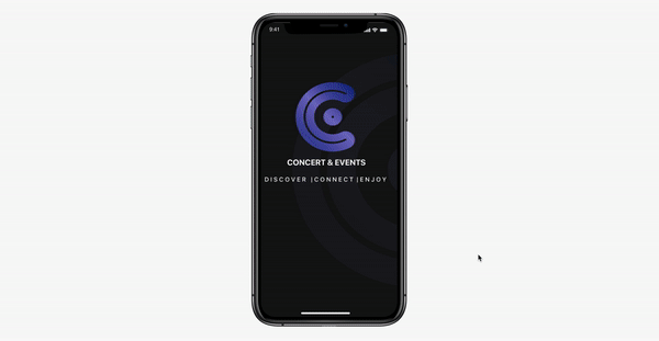
Concert Space is a mobile platform that helps users find the right music concerts, events for their favorite artist and style of music.

The main idea behind this project was to develop a usable, consistent, and organized system, that allows users to easily find their concerts favorite genre music style and artist around their location. Bringing the hottest shows near by them without missing another live show

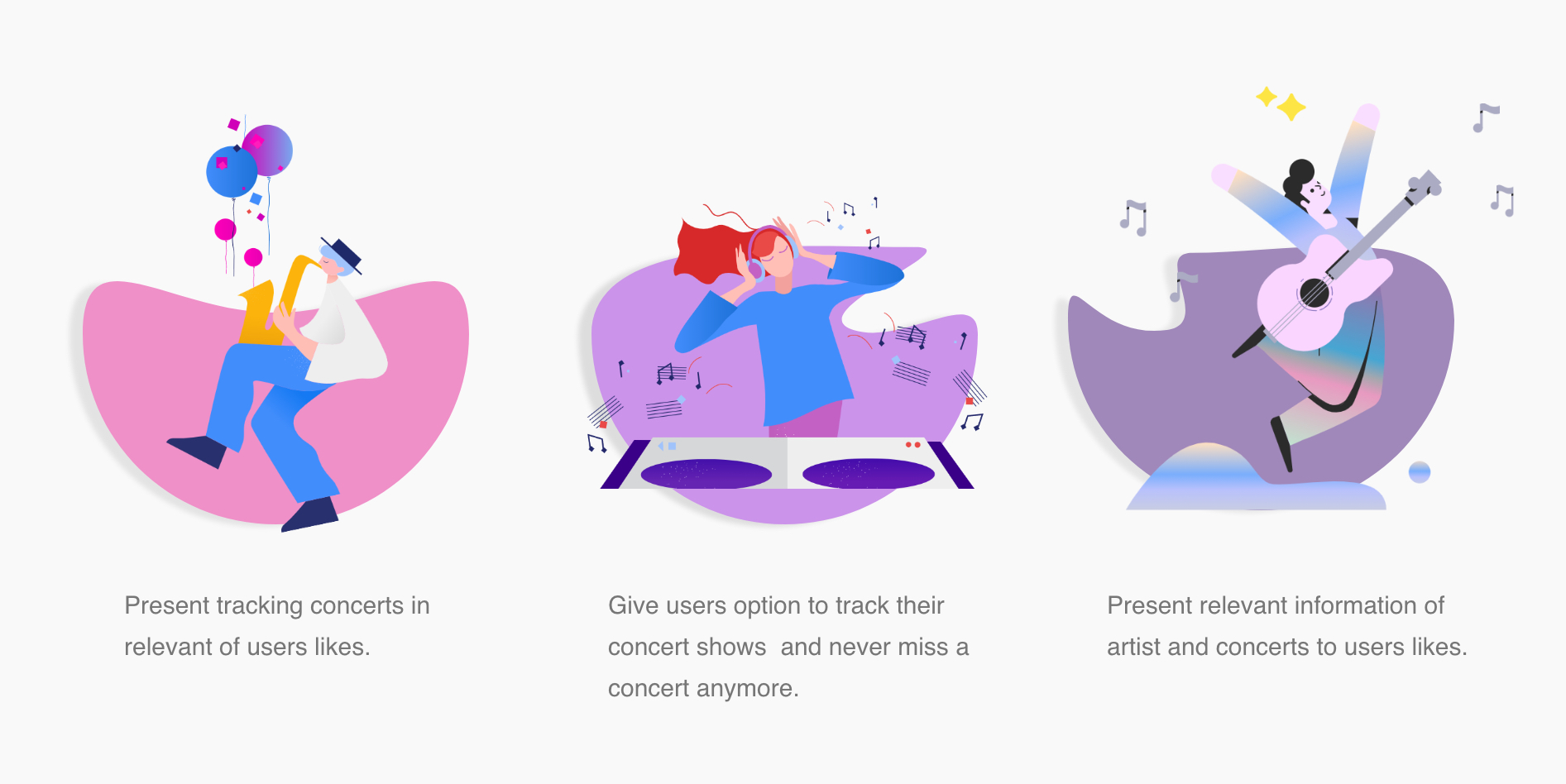
The variety of musical styles and shows is so big that minimizing the search is a main fuction of Concert Space App. By adopting the style and genre of music, the application can bring the information to you by location of the user, facilitating only concert of artists that the user is interested in.
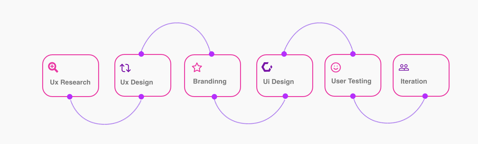
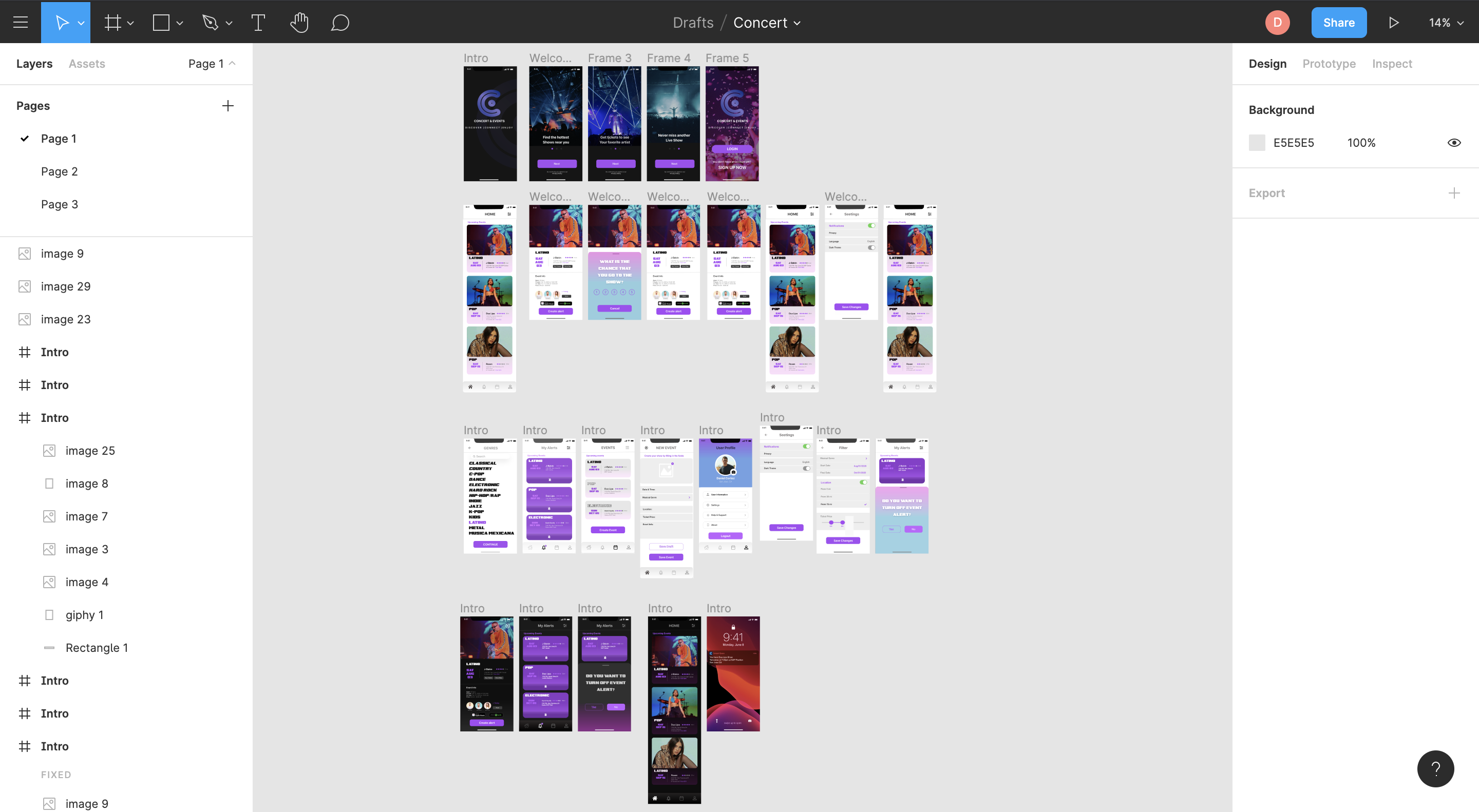
The solution was to the completed full cycle of design processes, from conducting user interviews and prototyping to creating design a whole interface of the App.


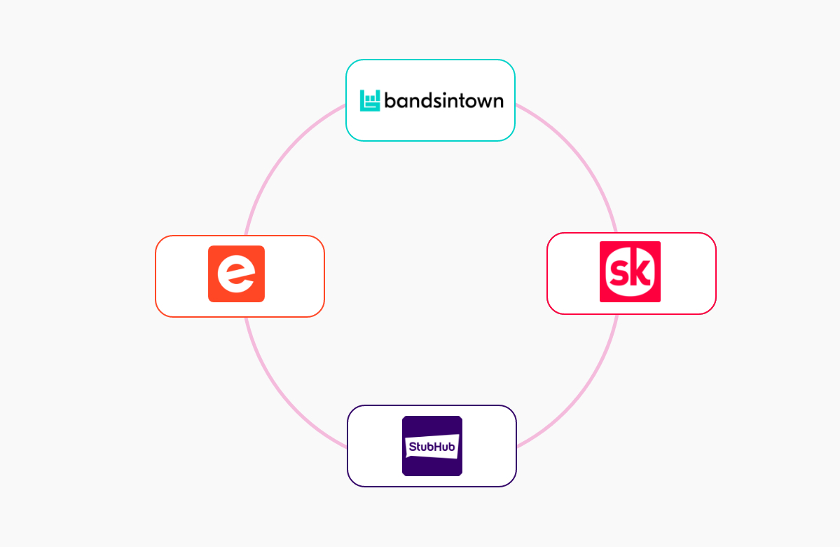
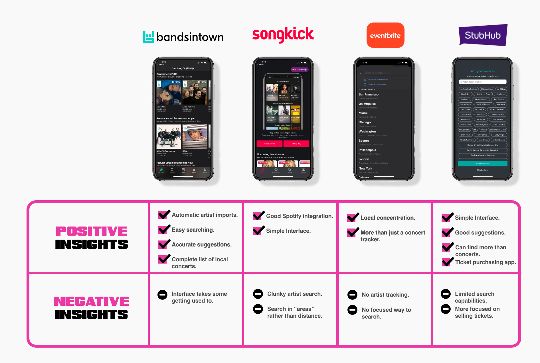
I analyzed four different industry leaders that had a concert service tracker to keep users informed whenever their favorite artists are going to be in their city, so users never miss another performance again. Brandsintown, Songkick, Eventbrite and StubHub.
These industry leaders have its unique features such artist imports, a large library integration, simple interface, local concentration and other features. After analyzing the leaders, I wanted to dive in more to get more insights about the industry by creating heuristic analysis.
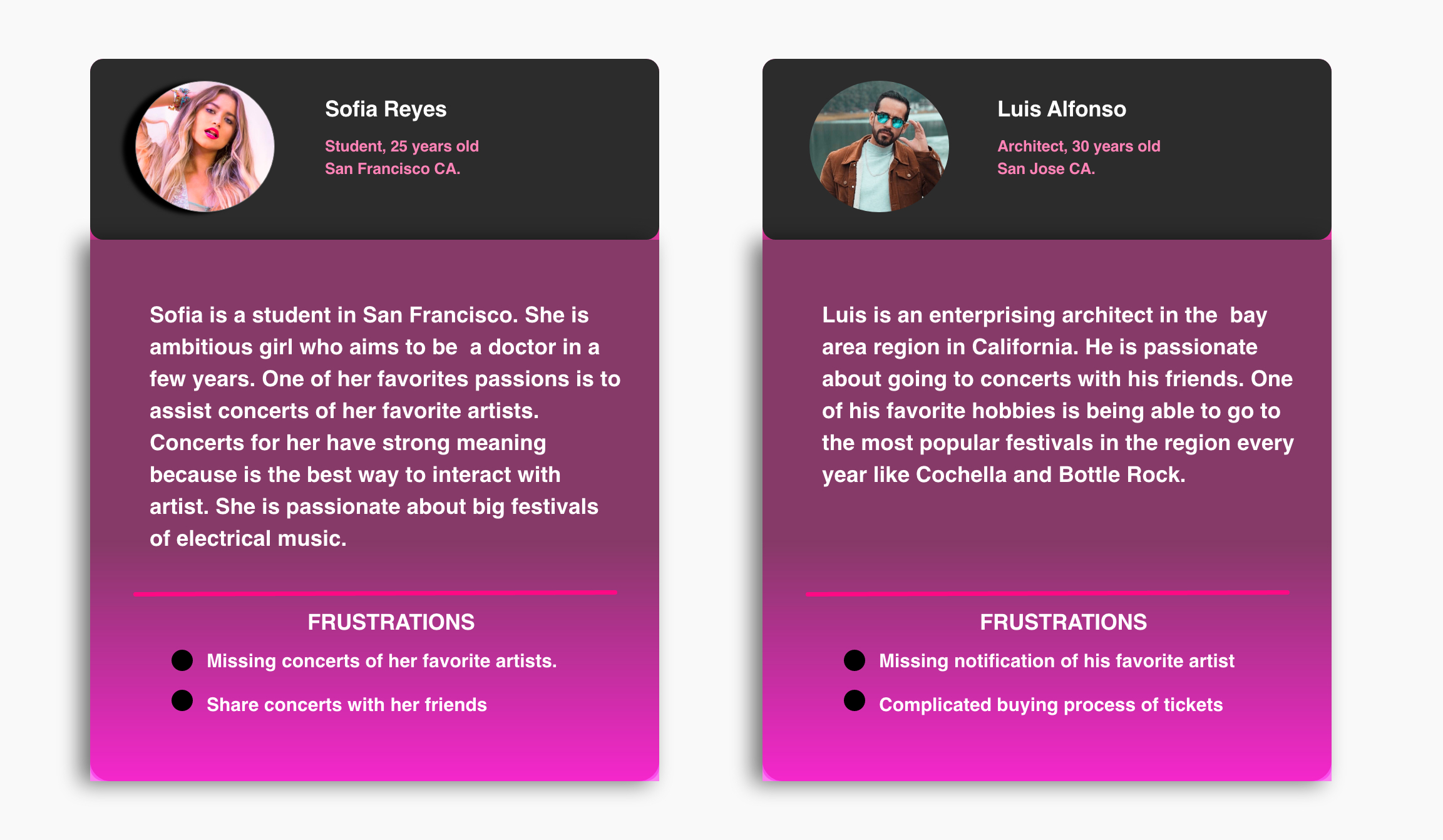
Questioning and surveys are easy way to collect the large data about users needs, goals and painpoints. This process was really helpfull to move the project one more step forward which is defining user personas.
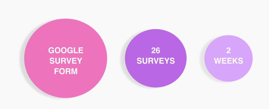
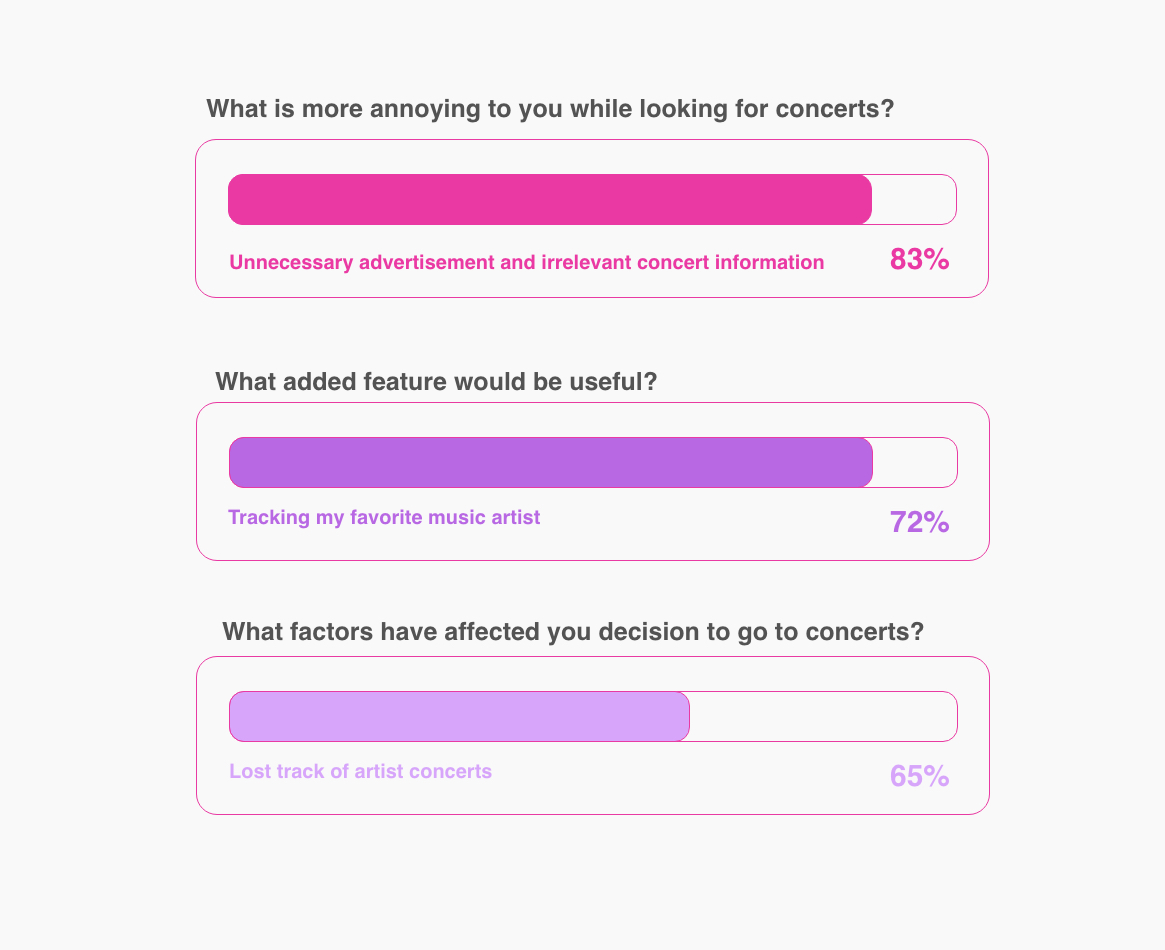
The survey was short and addresses the questions that I need to learn what is working and what is not working from the users perspective. I reached members who were currently using concert tracking apps. Getting those answers provided me key insights.
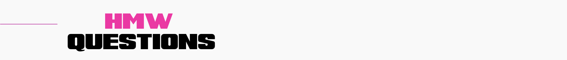
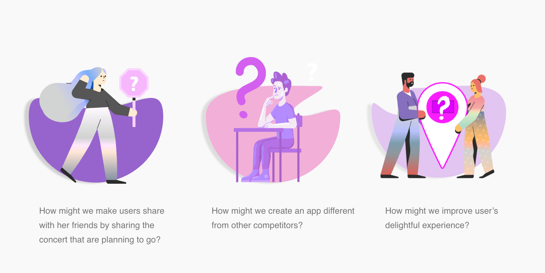
Based on my research, I created fictional personas in order to represent different user types. Creating personas helped me to understand the user’s needs, experiences, goals and frustrations. Using my persona’s goals and needs, I developed How Might We questions. This allowed me to define the problem before thinking about solutions.
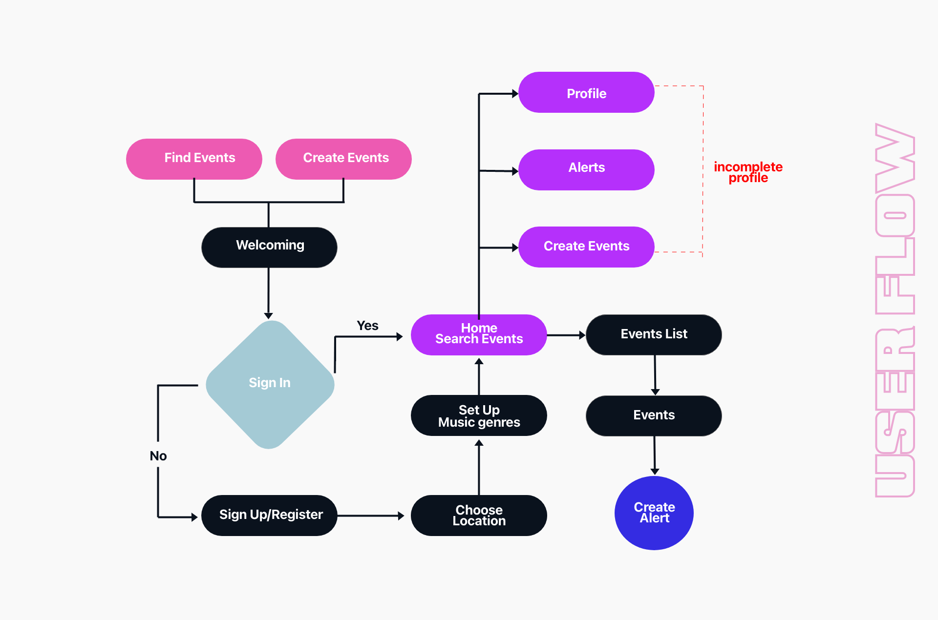
I created a user flow to determine how my primary personas will navigate through the app to minimize her frustrations using principal desire features. This user flow provided me a framework with which I used to build the individual screens in my initial Wireframe stage.

All the participants had an easy and intuitive experience during the flow. They enjoyed experiencing the app, however it needed to be improved by content and they preferred more attractive screens.
All the participants had an easy and intuitive experience during the flow. They enjoyed experiencing the app, however it needed to be improved by content and they preferred more attractive screens. The task of usability testing was to find and create and alert for the concert show and share it with their friends, when the user selected a show, I wanted to make sure if a friend will likely to assit that specific concent. They all completed the task. However, they wanted to understand more how thei friends will get the notification.
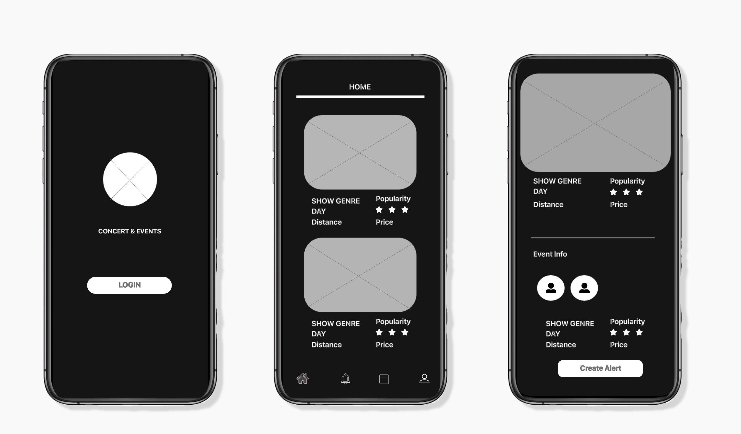
Before creating high fidelity prototypes, I wanted to create a visual language to keep the design consistent across all the elements in the product. Dark and Ligth theme UI suites my company’s brand since it is a concert tracking app.
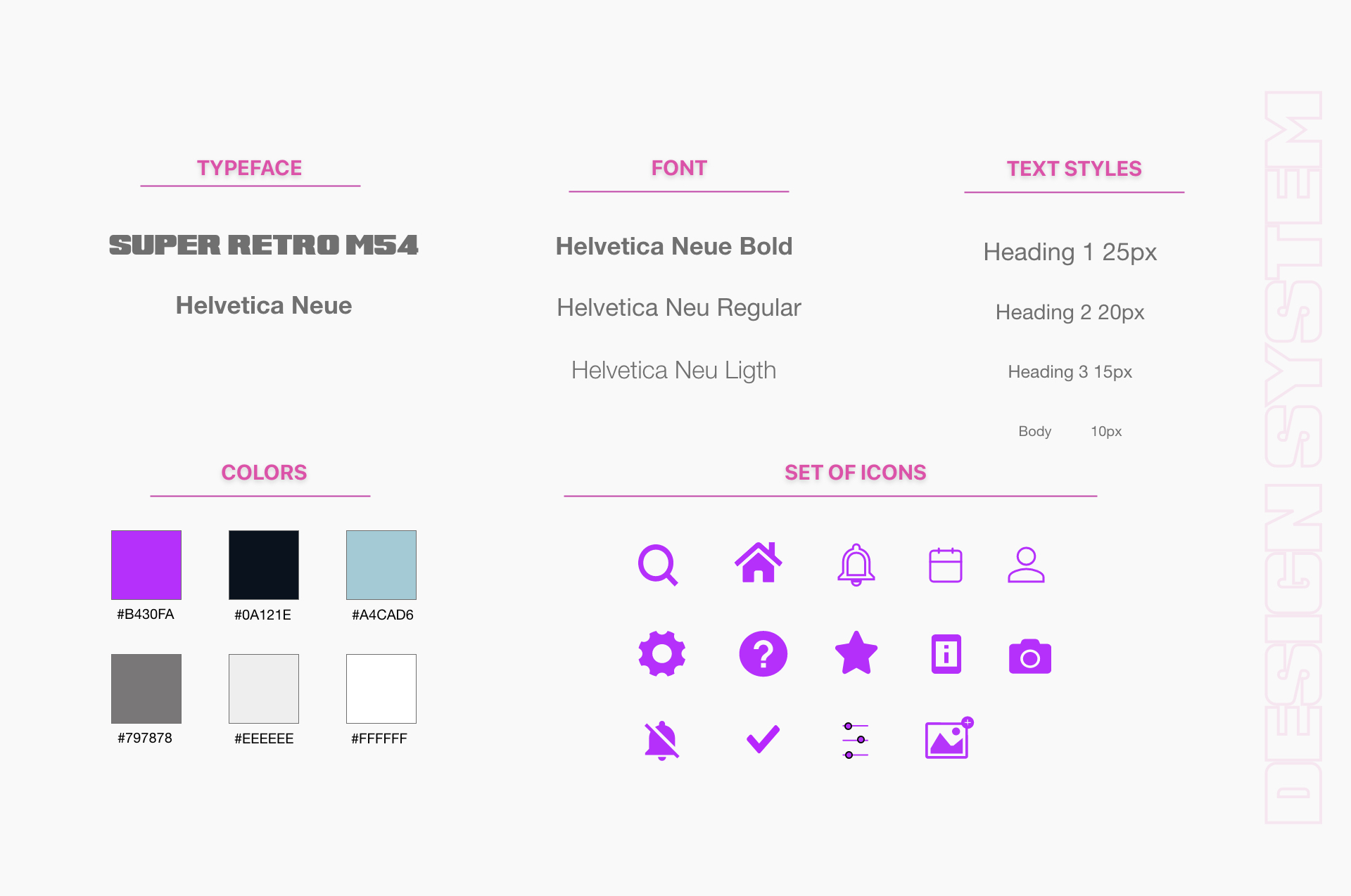
Pink and Purple symbolize compassion and ambition. They are usually preferred by young adults. both colors, represent joy and are considered a fun colors that provides emotional strength. It is optimistic and positivity to life and it encourages social communication and creativity.Both colors are a youthful and energetic colors.

I recruited 3 participants who had already used other alternatives app to track concerts. I asked participants to think out as loud as they used the app. They loved the overall visual style of the app, and provided contructive criticism of my design.
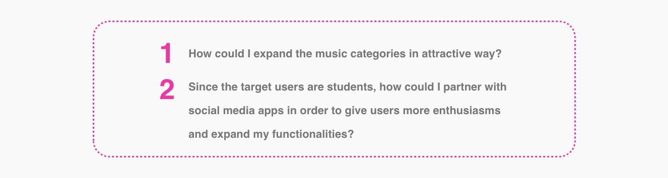
If I had more time
The duration of this design project was about 3 weeks, which meant I was limited in what I could address and the problems I could solve. If I work on this project again, or had more time work on it, I would like to solve these areas